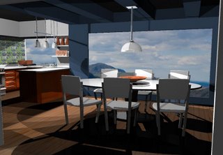
It's been a busy week. For once I was able to back-burner French which is good because I've been working a lot on my 3-d assignment this week. I had to create an interior space in Maya. I have attached pictures below. The lighting is bad because I didn't know what I was doing, but I'm proud of it. The teacher really liked it. I made a movie moving through the room, but it was like 120mb file - a bit large for a blog. So you are stuck with the stand alone picks. I'm toying with the idea of redoing the lighting and then trying to render it out in MUCH higher detail, but of course, it will take much LONGER and be much BIGGER files. We'll see if I have time.


I'm thinking about skipping my class tomorrow. I usually don't skip, but I'm really tempted since we have Friday off. That would end my week on Thursday at 4pm.


4 comments:
You are so cool ;-)
Love the room!
It looks great! The cabinets look kind of Ikea-like.
The kitchen turned out very well but the lighting is always a tricky thing. The lighting should have been a project in itself.
Post a Comment